Read about what went into the designing of this portfolio website including responsive design utilising W3 CSS framework.
Responsive CSS design
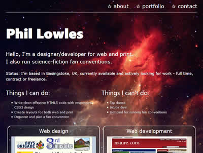
For this website I have used the W3 CSS framework to create a responsive design that will adapt to any screen size. In many ways I find a purely CSS solution to be a more elegant method of handling resizing. Please try changing the size of your browser window to see the responsive design in action.
One thing that I have amended in the framework is the way that quarter page size boxes work. I found the boxes become too thin to display content properly in tablet sized browser windows and so I added a new rule that would set the width at 50% so they become half page boxes. This works really well. So in a full size window the boxes are set at 25%, in a medium window they are 50% and in a small window (less than 600px wide) they are 100% of the available space. To ensure correct spacing there are also padding styles applied to the 2nd and 3rd children of the row using the nth-child psuedo selector, when the box widths are set to 50%.
This smart resizing design has been carried through to the home page where the content in the upper left half of the page will resize to fit 100% of the available space when the screen size is less than 993px wide.
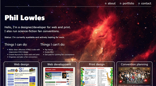
Home page layout
I was inspired to create the design for my portfolio home page, firstly by looking at dozens of other people's portfolio websites and noticing elements common to many of them, the things that worked really well. A big bold heading, a short summary statement and details about what I am looking for right now. Below this some boxed content showing the things I can do.
I couldn't decide what kind of background to use on my page, until a sudden thought came to me about using a starfield that would complement my interest in science-fiction and space in general. I imagined how it might look - a dark starfield with a bright red nebula to the right of the screen and set about finding the perfect image to use. The image I found is almost exactly how I imagined it, although I had to rotate and flip the image to get the nebula in the position I wanted. I believe it is an image of the Orion Nebula but I could not find a concrete source to confirm my suspicion.
HTML5 form elements
The form on the contact page uses HTML5 form elements to check for valid entries in the name, email and message fields. The red stars to the right of the input fields will turn green when the content is valid. Any attempt to submit the form without filling in all of the required fields will result in a message being displayed to enter the valid content.