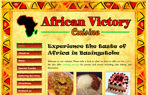
Website I am currently working on for a local African food restaurant in Basingstoke. This is an ongoing project that will also include print design work on menus and flyers. I worked closely with the client to create the restaurant logo which informs much of the site design and aesthetic.
This website is still a work in progress because the client has unfortunately been set back by problems with planning permissions and premises zoning issues. But once those are resolved we will get back to work on finalising the website details and completing the project.
Logo design
I sat down with the client to create a logo design for her business. They wanted to incorporate the outline of the African continent into it somehow and I set about finding a suitable image to use. From there we looked at a few different ways of using it and hit upon the idea of outlining it in bright colours. The client really liked bright and vibrant colours and the red, orange and green used here really popped and so this colour scheme became the basis for the entire website.
Background image
I asked the client to give me some examples of African artwork she liked that I could incorporate into the background of the website. She emailed me a number of examples and amongst them was this image found on Dreamstime (stock image supplier). I thought this could work really well for us and complement the bright vibrant colours of the logo design. The client agreed to purchase the image rights and I got to work editing the file in Fireworks.
The first thing I did was rotate the image 90 degrees clockwise. I decided to keep the border consistent all around so using only the border originally at the top I pasted this into place on all sides except the bottom. There was some delicate editing work to be done at the top left and top right corners to make this appear to fit naturally.
I quickly realised this was going to be difficult to implement throughout the website because it would not tile without giving away the seams where each tile meets. The file size is also quite high so trying to keep the background image as small as possible would be ideal, especially because the menu page of the website would be very long with a lot of content on it. Therefore I created several different versions of the background with varying heights and use the most suitable background size for each page of the website.
Downloadable fonts

I really wanted to give the website a vibrant feel with some interesting font choices. I found some suitable fonts in Ravie for the headings and Nyala for the main text. To ensure these would render for all users I implemented CSS3 downloadable fonts.
Navigation
The navigation buttons on the left hand side have a rustic design, almost like scrap wooden signs. I have used the same green outline from the logo design to highlight the current page and for mouse rollover using CSS.
Lightbox
While this is an African food restaurant they will also offer catering services including cake making. The client supplied several photos of cakes for the website to use as examples. The first thing I did was cut out all of these images to remove the backgrounds so that the focus remains solely on the cakes. I wanted to use a lightbox so that each image could be brought up bigger over the gallery. I found a suitable licence-free lightbox that utilises jQuery which works perfectly.